 Cookie preferences
6 Ad Design Ideas to Inspire Your Creativity
2. Utilize Negative Space Creatively
Negative space, the empty areas around design elements, can be used to create dual imagery or convey subtle messages, adding depth to your ad. An example that we came across is from the World Wide Fund in China, with a panda theme:
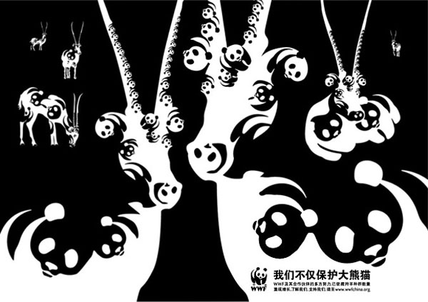
The black and white ad design cleverly uses pandas to assemble different shapes of another animal, illustrating the message that: "We don't only protect pandas, we protect all animals." This simple yet striking design reinforces WWF’s broader conservation efforts while making viewers engage with the ad on a deeper level.
Staying on the theme of pandas, Firelli's ad design idea also translated very well in real life:
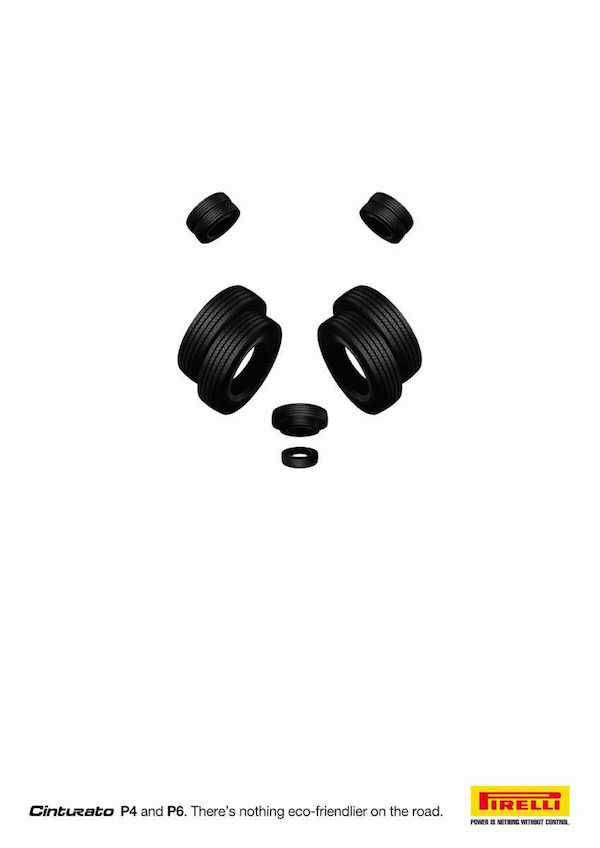
A few simple arrangements of the tires reveal the face of a panda. The rest of the ad design just consists of white space and a small logo and tagline at the bottom. These kinds of creative ad ideas invite viewers to take a second look, drawing them in as they decode the hidden image. The result? Increased engagement, longer viewing time, and a memorable brand impression.
3. Incorporate Bold Typography
Typography as Art: Using bold and distinctive fonts can make your message stand out. Typography art, to a degree, needs to be readable, but the focus is often on its visual elements that convey emotion and character to carry the message. Let's see an example that takes the first part of the Chinese character "create" and arranges it to reassemble a house with a lightbulb coming out of the "chimney":
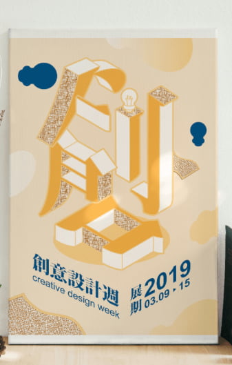
Source: 秋香, 凡維
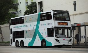
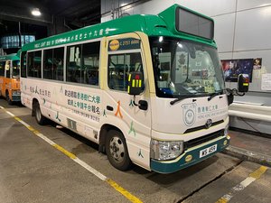
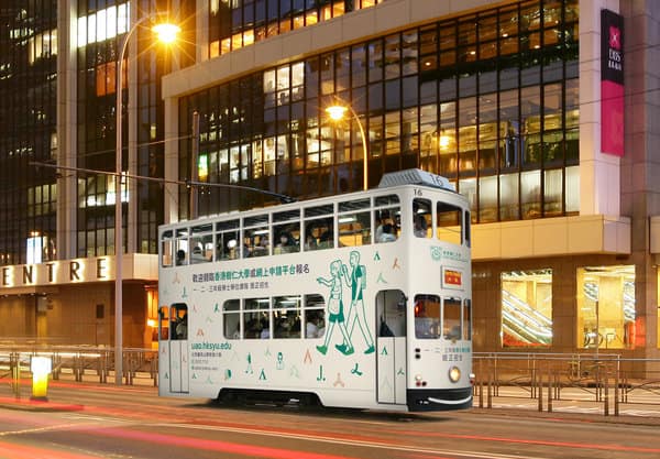
Another example from Hong Kong Shue Yan University:
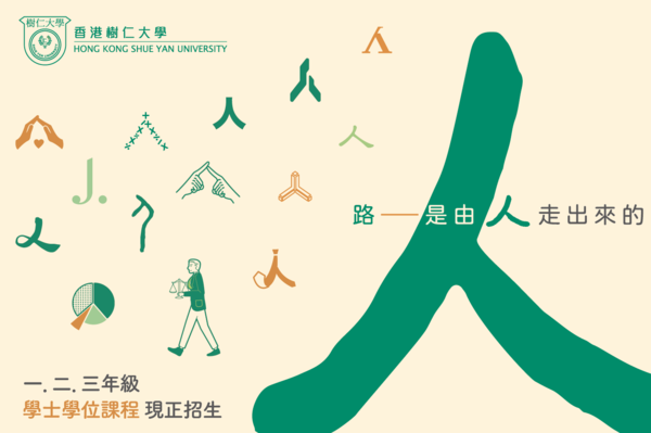
Source: HKSYU Admissions Office
This 2022 university recruitment campaign took a creative typographic approach by reimagining the Chinese character for "human" (人) to visually reinforce its message: "The path is created by those who dare to walk it."
The character itself resembles a person walking, making it the perfect symbol for ambition, movement, and progress. By cleverly highlighting and modifying this character in the design, the campaign not only caught the eye but also encouraged prospective students to see themselves as trailblazers—ready to forge their own paths.
This campaign was even promoted on various advertising formats, including bus advertising, tram advertising, and green minibus:
4. Leverage Nostalgia
Nostalgia is a powerful tool in advertising because it taps into familiar emotions, evoking warmth, trust, and a sense of belonging. By referencing past experiences, cultural icons, or design styles, brands can create an instant connection with their audience. This approach works especially well in an era dominated by digital media, where people often crave something tangible and familiar.
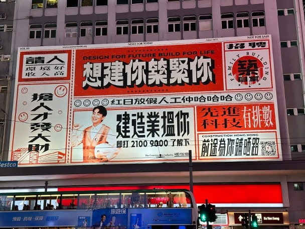
In another article, we mentioned this nostalgic ad design idea by Construction Hong Kong:
Read related article: Top 7 Best Ads of 2023
The nostalgic ad campaign cleverly reimagined traditional job advertisements from old newspapers. The playful typography and vintage-style wording drew from print ad design ideas and paid homage to the industry’s rich heritage. It was a great blend of past and present—turning a familiar format into something fresh, engaging, and unexpectedly eye-catching.
Another great creative ad design idea using nostalgia is from McDonald's Japan. This campaign embraced Y2K with a retro-style coffee ad that mimicked early 2000s personal websites. The design featured pixelated icons, a diary and message board layout, and a visitor counter showing “#000120,” cleverly matching the coffee’s price of 120 yen.
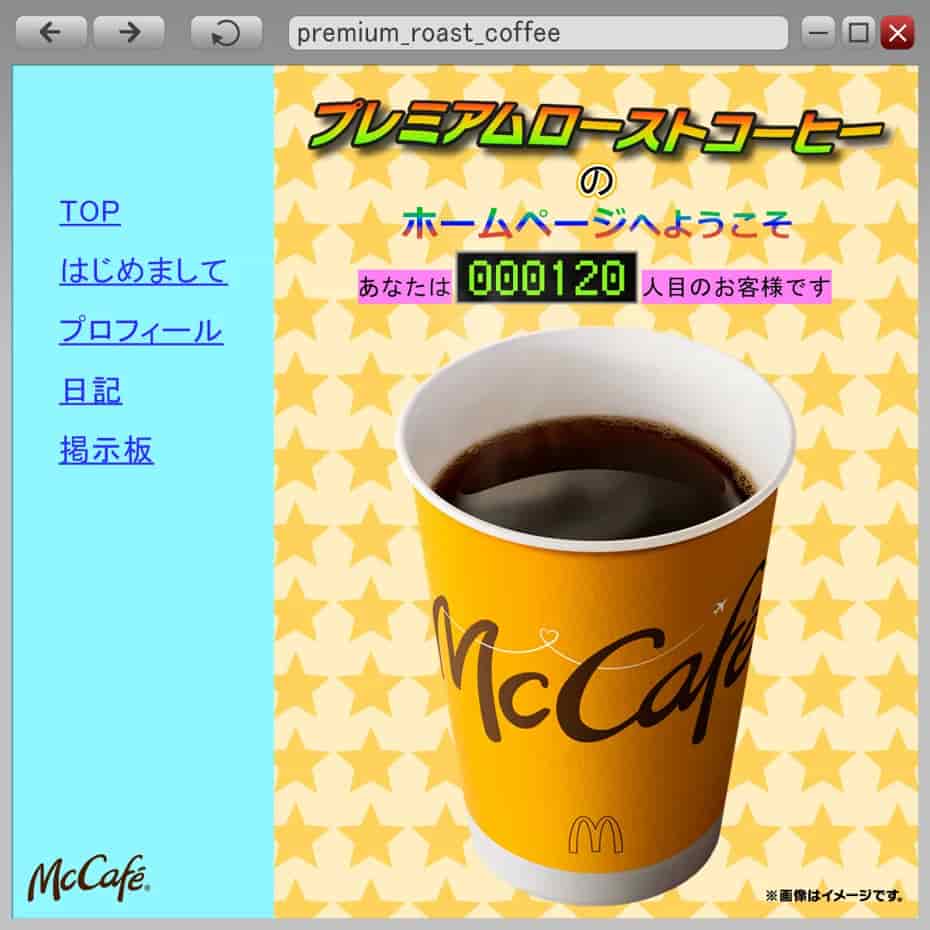
Source: McDonald's Japan
The ad instantly went viral, with many comparing it to Abe Hiroshi’s famously outdated website, a long-running internet meme. By tapping into shared digital memory, McDonald’s turned a simple promotion into an engaging, nostalgia-fueled conversation piece.
5. Engage with Interactive Elements
Interactive ads break the traditional one-way communication model by inviting consumers to actively engage, making the experience more immersive and memorable. Instead of passively viewing an ad, audiences participate—whether by clicking, swiping, scanning a QR code, or customizing elements within the ad. This boosts engagement, increases brand recall, and encourages social sharing, making interactive ads particularly effective in the digital era.
One powerful print ad design idea that uses physical interaction immediately came to mind:
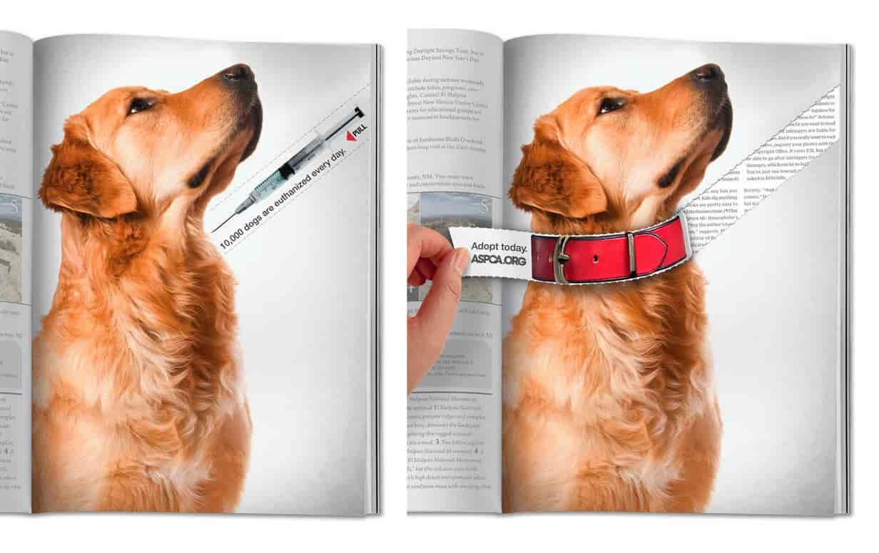
The magazine ad featured a heartbreaking image of a dog with a needle hovering near its neck, alongside the statement: "10,000 dogs are euthanized every day." However, readers were encouraged to tear off the section containing the needle, revealing a dog collar underneath with the words "Adopt today." This impactful design turned a static print ad into an interactive, emotion-driven experience, reinforcing the urgent need for adoption in a way that left a lasting impression on the audience.
Let's see another one:
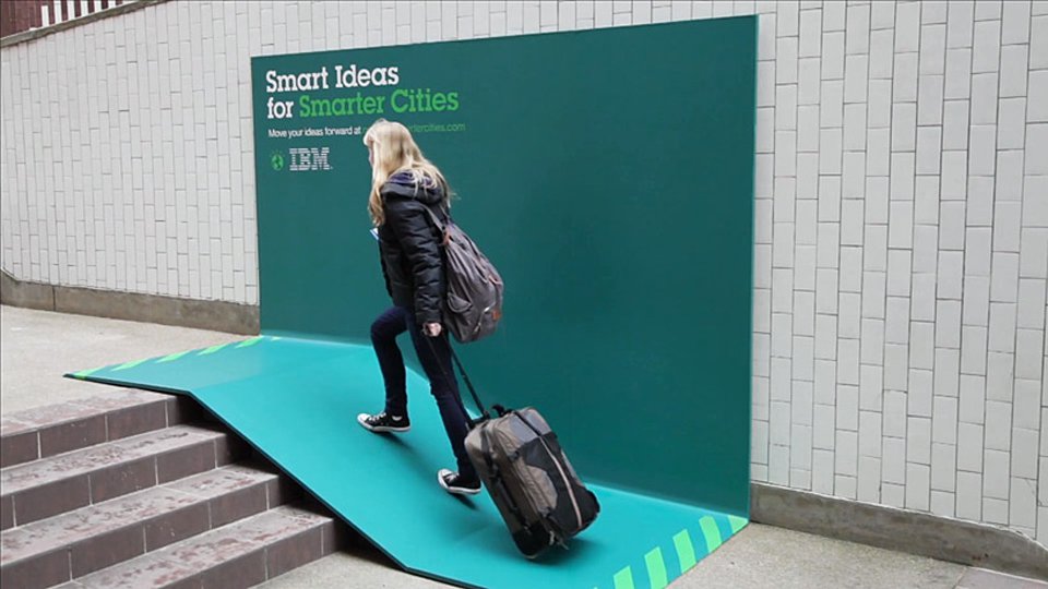
IBM’s "Smart Ideas for Smarter Cities" campaign took OOH advertising beyond visuals by making it functional. One standout execution was a billboard that transformed into a ramp over a set of stairs, providing convenience for luggage carriers and wheelchair users. Other designs doubled as benches and rain shelters, seamlessly integrating IBM’s message into urban life.
6. Experiment with AI-Generated Content
AI-generated content is transforming ad design by making it more personalized, efficient, and innovative. Instead of relying solely on traditional design methods, brands can now use AI to create dynamic visuals and generate unique ad variations. Like this Heinz ad:
.jpg)
AI can even tailor messaging to specific audiences in real time. This not only saves time and resources but also allows for hyper-personalized campaigns that adapt to user behaviour. This next example is one of the best ones we've seen yet:
Pedigree’s “Adoptable” campaign took a fresh, tech-driven approach to dog adoption by using AI to give shelter dogs a "glow-up" in ad placements. The campaign transformed ordinary shelter photos into high-quality, eye-catching images, seamlessly integrating them into Pedigree’s DOOH ad designs. The ads were location-based, meaning the dogs featured were actually up for adoption nearby—making it easier than ever for potential pet owners to connect with them.
And it worked! Within just two weeks, 50% of the featured dogs found homes, and shelter visits shot up sixfold.


 Top fan-driven outdoor campaigns in Hong Kong
 Why run an outdoor campaign in Hong Kong?
 Top 10 advertisements in Hong Kong
 5 Steps to launch an outdoor Campaign in Hong Kong
 How to Create An Advertising Budget? 2026 Guide, Tips, and Formulas
 Understanding YouTube Advertising Costs in 2025
 The Most Widely-Read Magazine and Newspaper in Hong Kong
 Top Social Media Platforms in Hong Kong 2025 | Usage Trends & Marketing Insights
 OOH /DOOH advertising in Hong Kong: Formats and Rates (2025 Update)
 How much does LinkedIn Advertising Cost? (2025 Update)
